
Close collaboration with writer John Carruthers to identitfy key themes with technologists during a thorough interview process.
A rigourous grid and typographic system was the basis for the austere visual language while providing clarity and structure for the narrative.
All content conformed to an underlying baseline grid. Three type sizes were used, each with a specific purpose and relationship to the grid.
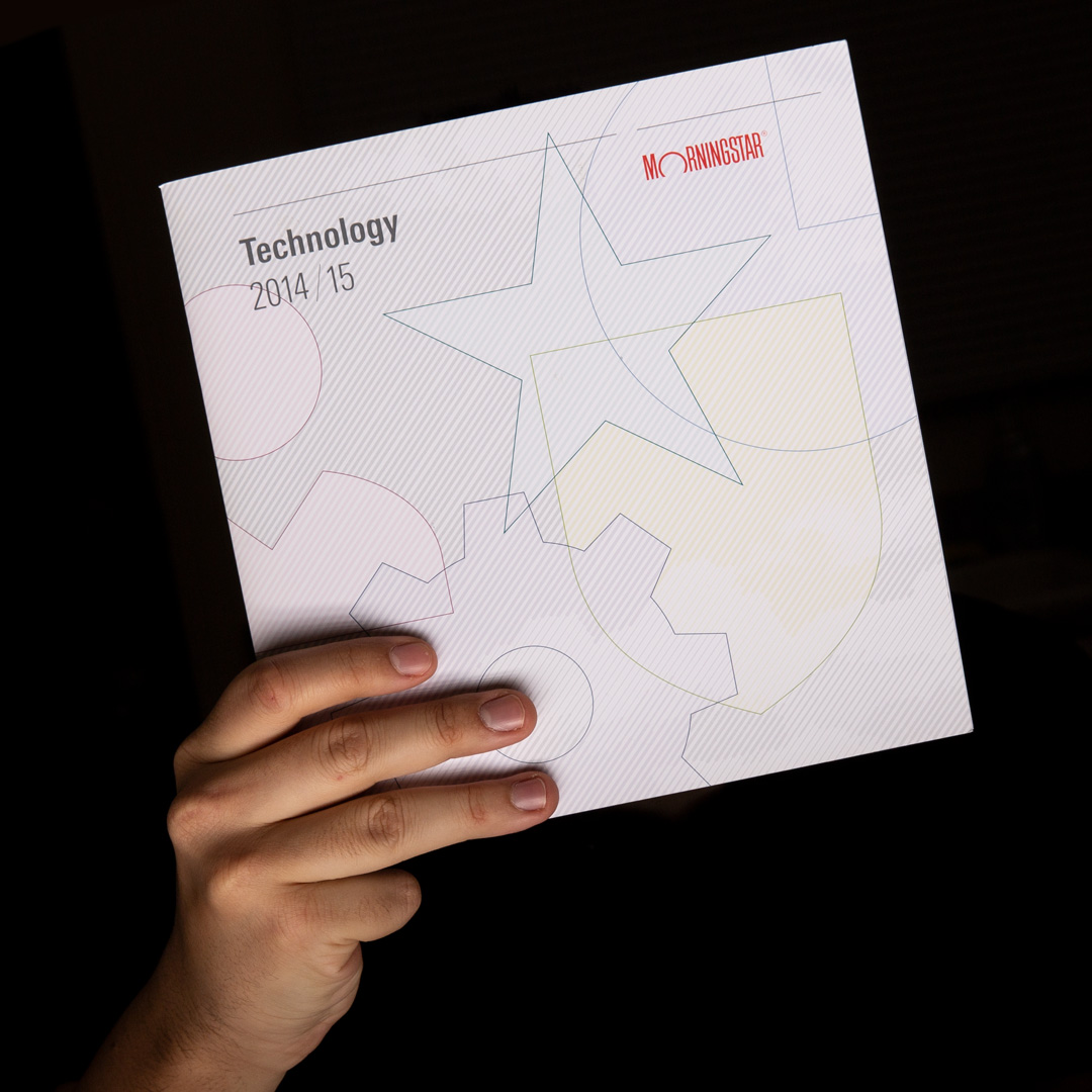
The cover is composed of five interlocking icons representing each major section within. Built as an annual report, each year would maintain this composition while applying a new aesthetic layer relevant to that year. The second iteration, shown here, uses a background texture from a recently launched flagship product.
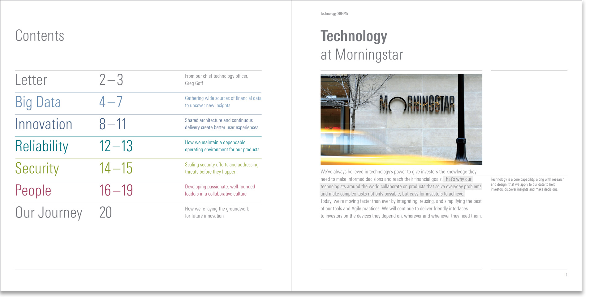
The opening spread established the structure of the book and its corresponding thematic colors.
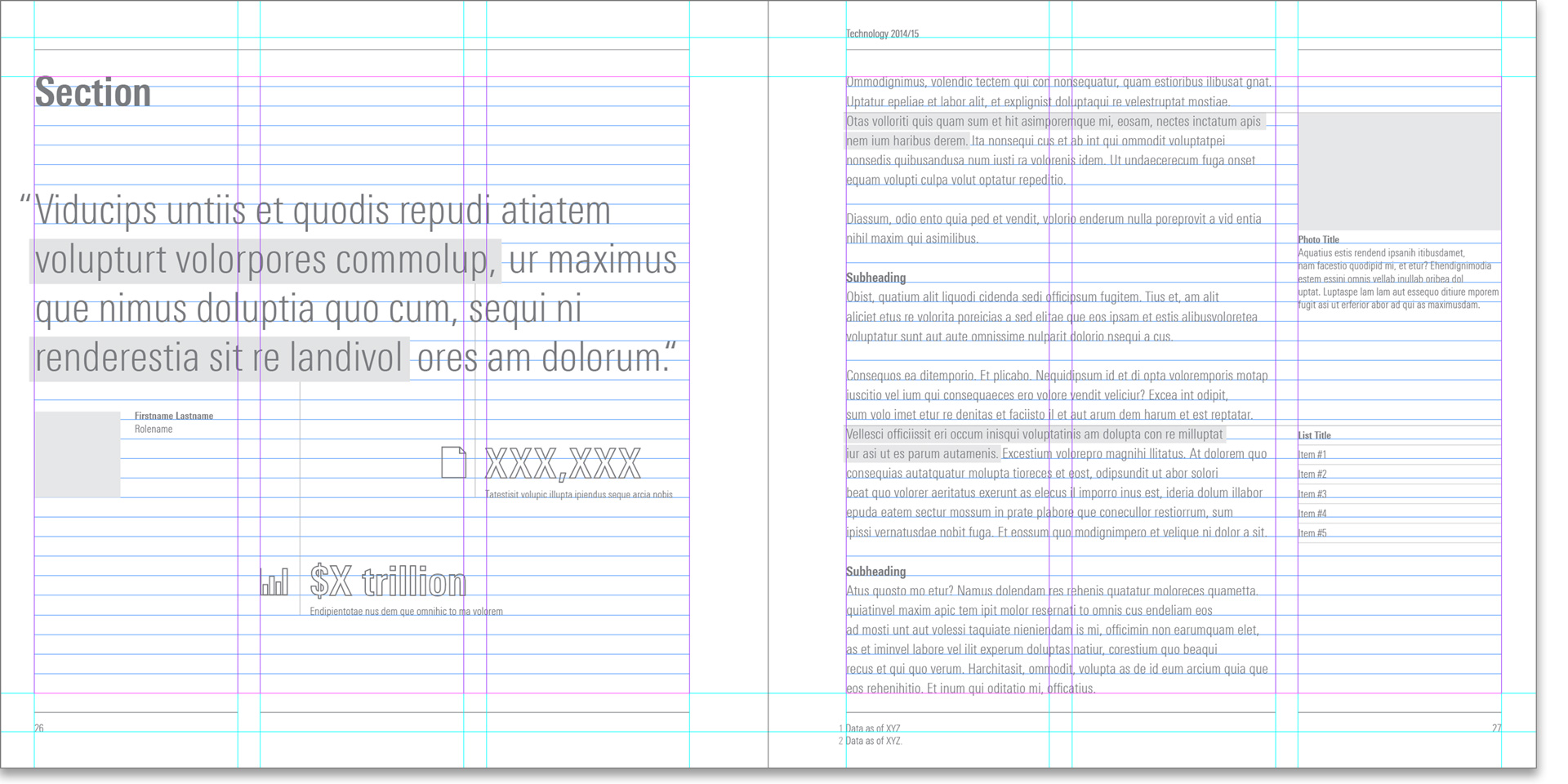
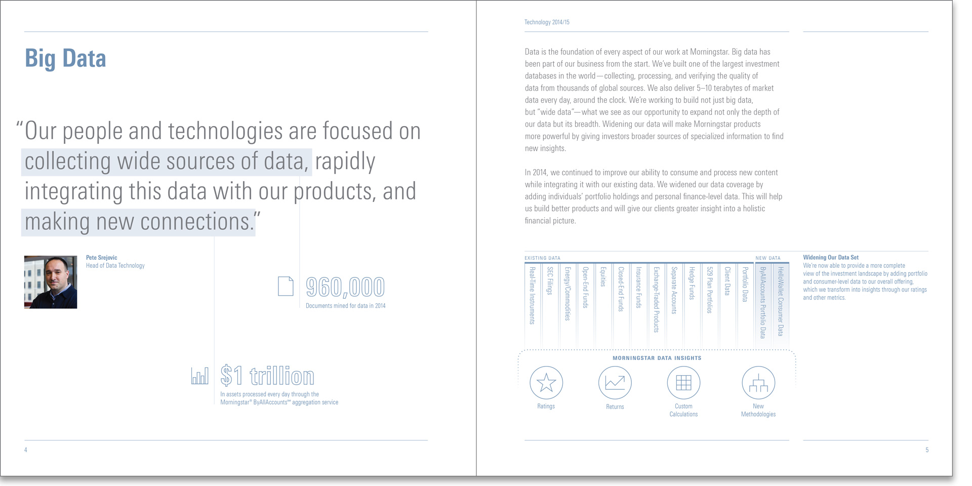
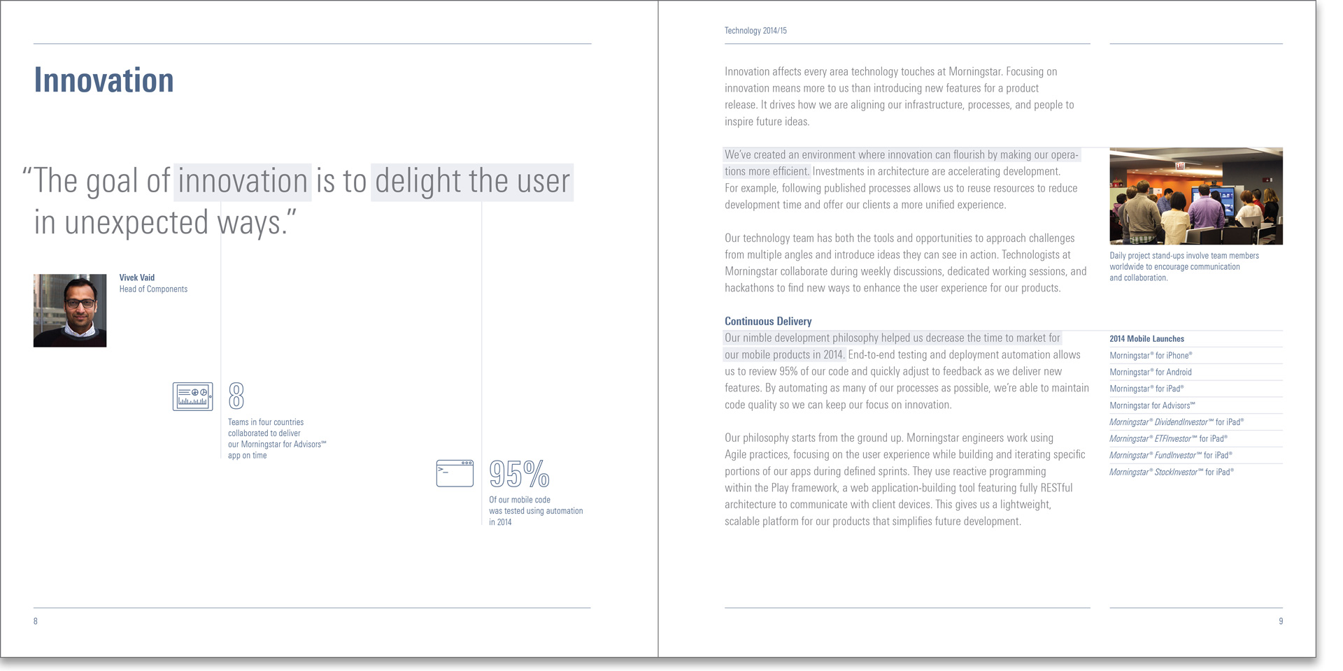
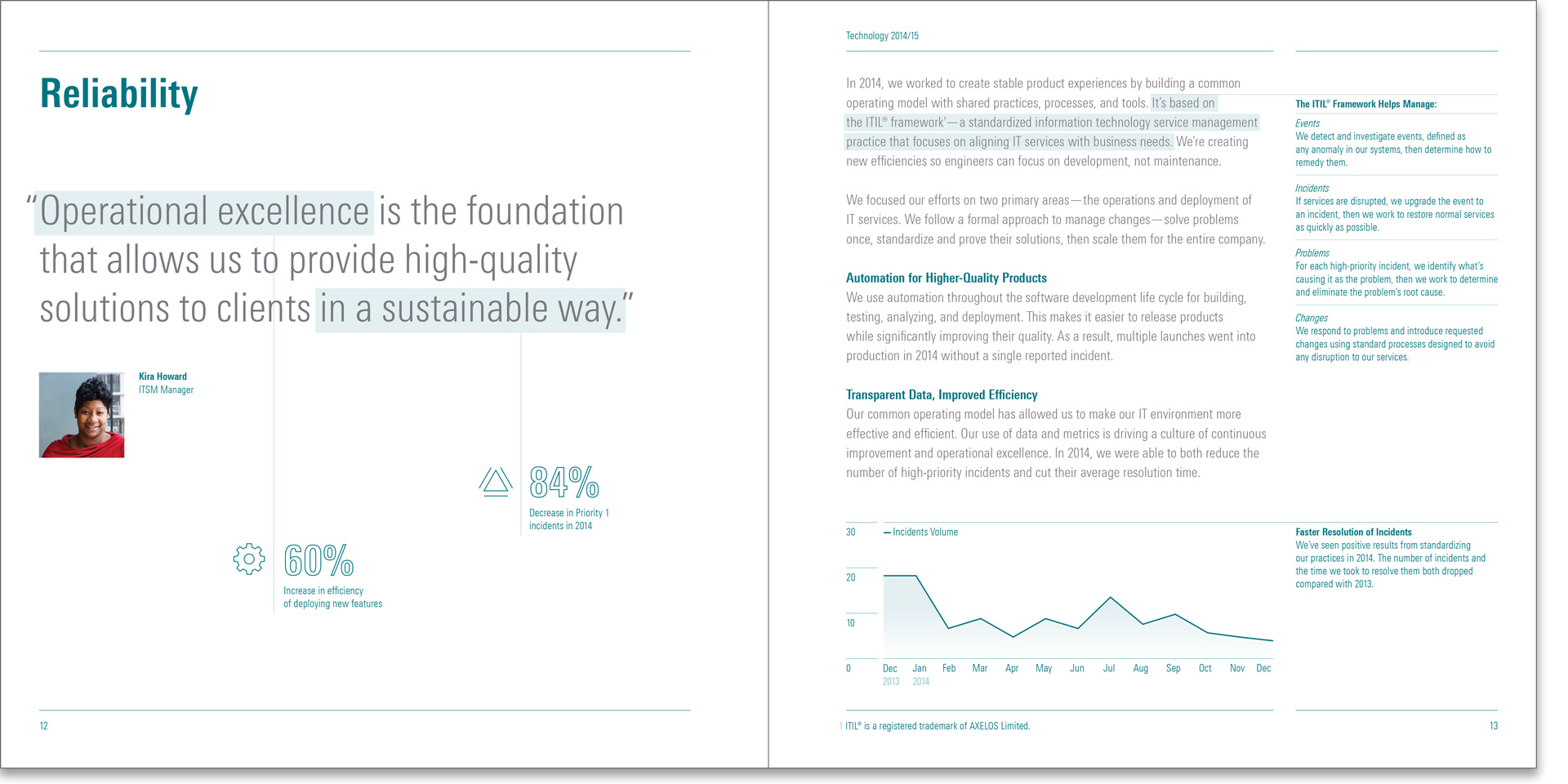
The highlight motif, a narrative device used throughout the book, is introduced here revealing section-specific takeaways to readers.
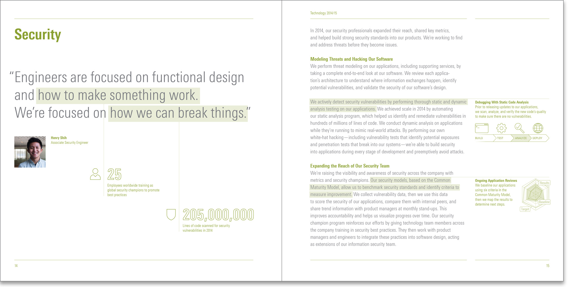
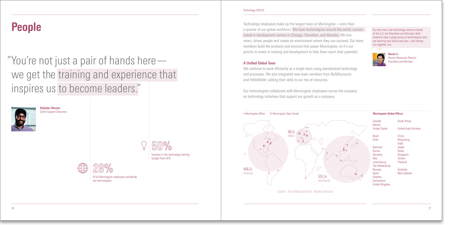
To elevate the voice of the employees, each section opened with a quote from a leader within technology along with relevant datapoints on that topic.
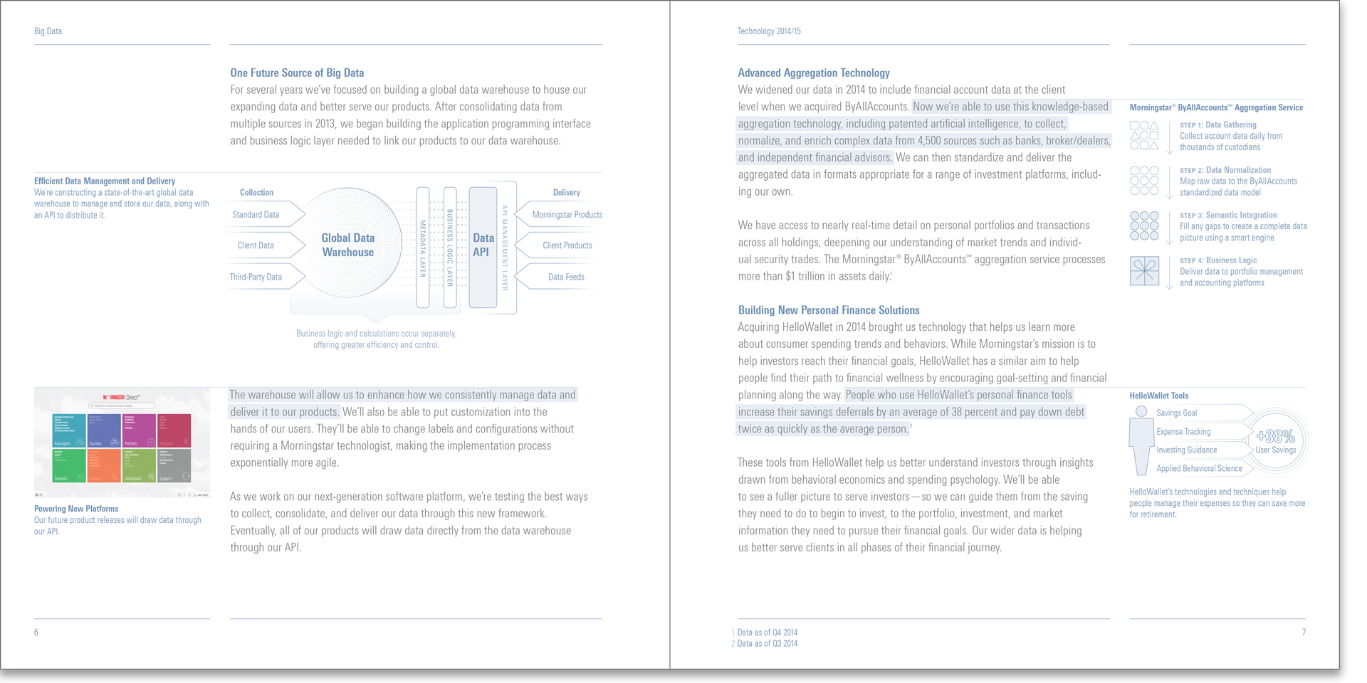
Given the velocity of the project, the highlight motif was developed as a design solution to allow us to flexibly add detail throughout without disturbing the main narrative.
Though primarily a piece for technologists, certain data-gathering and editorial exercises helped us extract messages and figures that could aid our sales and marketing efforts as well.
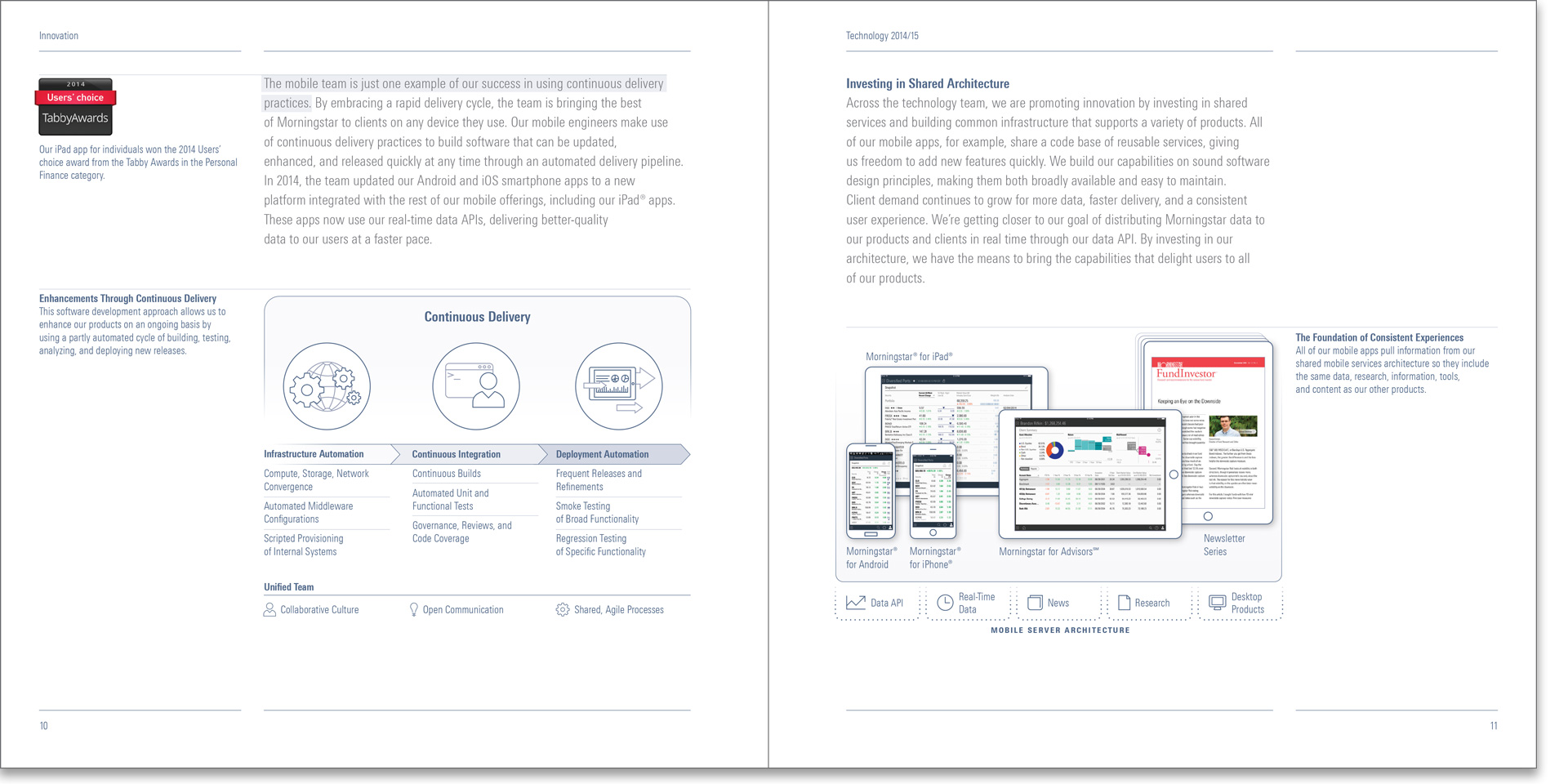
The iconography, typography, and color were drawn from the visual language of the products—harmonizing this marketing piece and the visible face of the technology manifested through the products’ UI.
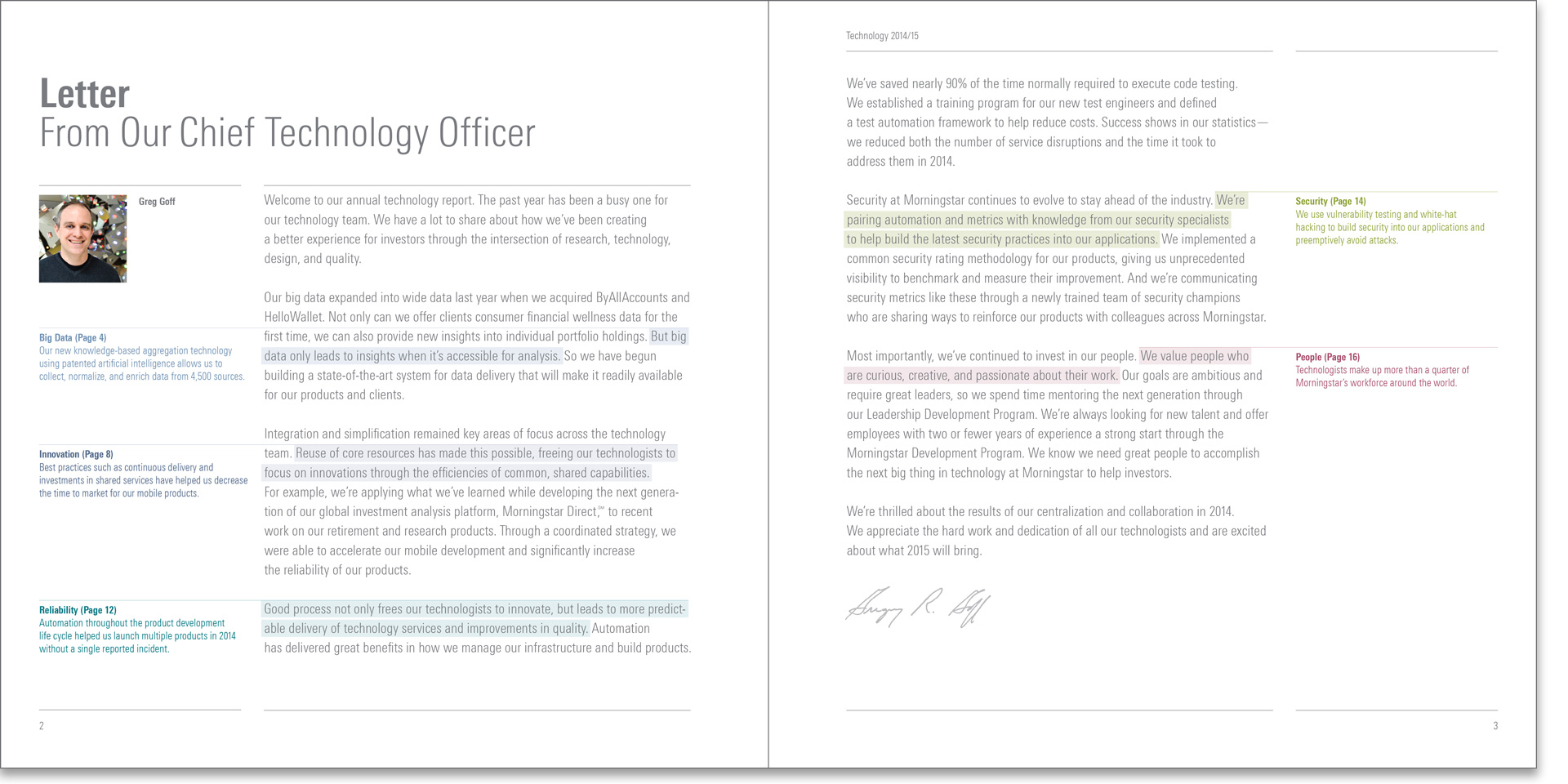
Given the range of technical literacy with its readership, the margin space often was used to add context around technology concepts vital to the core narrative.
Being outside the technology group, we were able to interpret and objectively translate facets of Morningstar’s technology in a way that was accessible and resonated across all parts of the business.
This project also began to define a cultural identity and point of view for technology at Morningstar as we were articulating many of these concepts for the very first time.
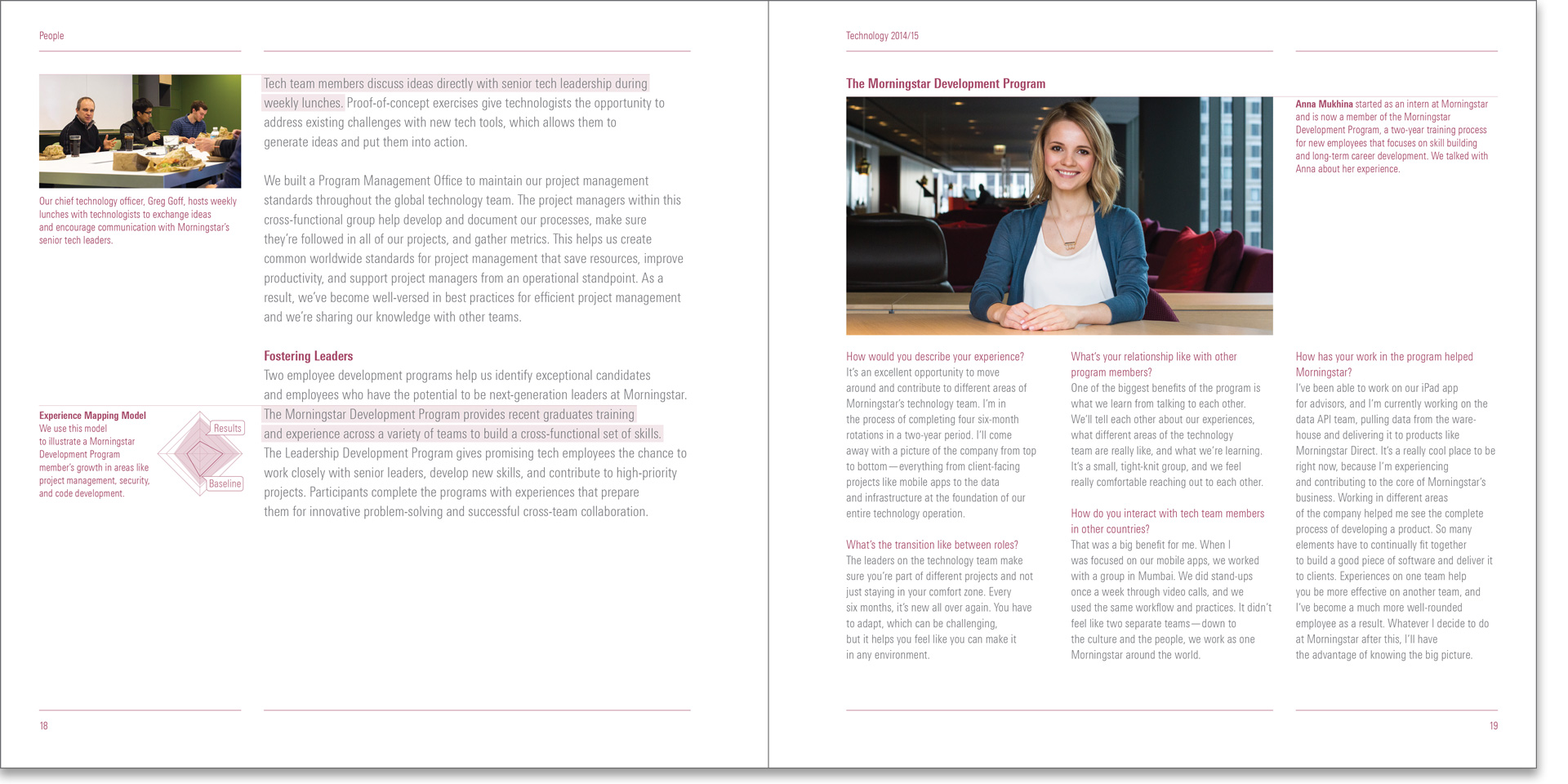
Alongside with designing the publication, I shot all the photography to carry forth the same level of cohesion established with the typography across all the images as well.
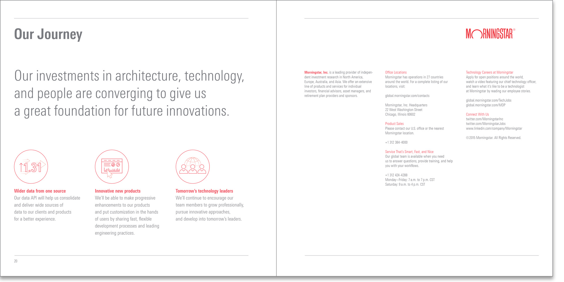
Lastly, the conclusion provided a look at the technology strategy for the upcoming year along with relevant contact information.